Much has already been written about the Starbucks Mermaid, also often referred to as the Starbucks Siren. But it is a great story and very relevant to our main topic here, so I’ll cover the highlights.
According to the Starbucks website, when the Starbucks coffee chain was being started in 1971 the owners wanted to “evoke the romance of the high seas and the seafaring tradition of the early coffee traders” by using a name from the classic novel “Moby Dick” by Herman Melville. In the book, the name of the whaling ship is Pequod and the name of the Chief Mate on the Pequod is Mr. Starbuck. It came down to a choice between using ‘Starbucks’ or ‘Pequod’, and we probably all agree that Starbucks was the right choice.
Now that they had a name, the company needed a logo, and in keeping with the theme of the high seas and seafaring, a mermaid was picked for the company logo, inspired by an old – probably 15th century – illustration of a mermaid that can be found in A Dictionary of Symbols by J. E. Cirlot.
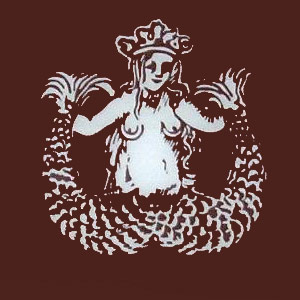
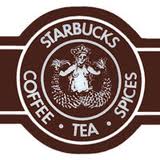
Here is the old illustration of a mermaid image, and the original 1971 Starbucks logo with the mermaid. It is clearly the same image, with some of the details modified and unnecessary lines removed.
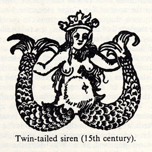
Twin-tailed mermaid illustrations and sculptures are not uncommon in history at all, dating back at least to the 7th century.
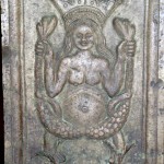
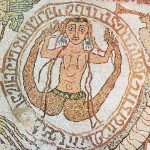

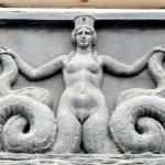

In fact, many of the mermaid statues found in this book are twin-tailed mermaids. Even the most famous mermaid statue of them all – Edvard Eriksen’s statue of The Little Mermaid in Copenhagen – is a twin-tailed mermaid, despite the fact that in the Hans Christian Andersen story the mermaid only has a single tail.
When depicted with a crown, old mermaid illustrations almost certainly refer to the story of Melusine, who according to legend was transformed into a mermaid every Saturday. She married Prince Raymondin of Poitou – without mentioning her little transformation problem – and with him founded the royal House of Lusignan and bore him 10 or 11 children.
The house of Lusignan ruled much of Europe from the 12th through 15th centuries, so Melusine would clearly have been entitled to wear a crown.
The 1987 Starbucks Logo:
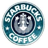 Starbuckskept its original logo for 16 years, until 1987 when the original owners sold the company to Howard Schultz. That year the logo changed to one that was more stylized and modern – the first step in refining and evolving the logo towards what it is today.
The 1987 logo removed “Tea” and “Spices” from the logo to get a cleaner logo focused clearly on coffee, and while it kept the twin-tailed mermaid with a crown, it used much cleaner graphical lines and positioned the mermaid’s hair so her breasts were no longer visible.
The 1992 Starbucks Logo:
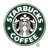 5 years later, in 1992, Starbucks became a publicly traded company, and a new and updated Starbucks logo was introduced. This version lasted much longer, and from 1992 to 2011 this was the logo for Starbucks. It was no longer completely obvious that the logo represented a mermaid, and people could be forgiven for not realizing that the logo – and Starbucks – had any connection to a mermaid.
It was another step in the direction of greater simplicity and elegance, and it was achieved without giving up anything essential in the 1987 logo.
The 2011 Starbucks Logo:
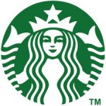 Finally, in 2011 the current Starbucks logo replaced the 1992 logo, which had a 19-year run, the longest yet for a Starbucks logo. The current Starbucks logo took the idea of elegant simplicity a step or two further, making the logo even cleaner, less complex and and less locked into a specific product.
With the removal of the Starbucks name and the word “Coffee” removed, the logo became more iconic, and does not in any way constrain the image and logo of the company to the business of coffee.
Keeping the Mermaid Lively:
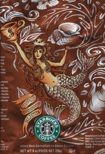 While the Starbucks logo has become steadily more refined and stylized over the years, 1996 saw the introduction of the Starbucks Anniversary Blend, and with this the mermaid has made a fresh appearance each year in a fun, whimsical and entertaining style on the Anniversary Blend packaging.
Next time you visit a Starbucks coffeehouse you may want to spend a little time exploring the many different ways the mermaid … siren that is … makes her presence felt.
References:
http://www.starbucks.com/about-us/our-heritage
http://www.starbucks.com/blog/so-who-is-the-siren
http://thewideeyedlegless.typepad.com/blog/2011/09/a-tale-of-two-tails.html
http://www.deadprogrammer.com/starbucks-logo-mermaid/
http://www.fastcodesign.com/1662986/with-eyes-on-world-expansion-starbucks-drops-its-name-from-new-logo
http://www.underconsideration.com/brandnew/archives/starbucks_back_to_the_future.php
http://symboldictionary.net/?p=1153
http://www.atlasobscura.com/articles/the-siren-on-your-starbucks-cup-was-born-in-7thcentury-italy
http://whatdoeshistorysay.blogspot.com/2012/07/who-was-melusine-water-fairy-mermaid-or.html
http://idsgn.org/posts/starbucks-reveals-new-logo-drops-wordmark/
https://www.dailycupo.com/starbucks-logo-meaning
